East Bay Sanctuary Website Redesign
Tools Used: Miro, Figma, Adobe Illustrator, Photoshop
Working in a group of four, we decided to redesign East Bay Sanctuary Covenant’s website to have clear organization making it more accessible to its users and personnel. My respnsabilities included research, wire framing, and visual design.
The Problem
The East Bay Sanctuary website was designed to assist undocumented immigrants in the naturalization process as well as reach out to potential donors and volunteers. We have observed that the website has organizational issues as well as accessibility issues, which creates an entry barrier for many clients. How might we improve the East Bay Sanctuary’s website so that their customers have a seamless experience and get the help that they need?
Our goal is to redesign the nonprofit’s, East Bay Sanctuary, website to make it more accessible to its users and personnel. As the website stands currently, the primary users are volunteers and donors and one of our goals is to make sure the website is targeted towards and welcoming of immigrants. We want to conduct an evaluation of the original website and connect with the administrators to learn about their needs.
Our Research
In order to learn about the organization and its users, we decided to interview a number of people, both active users, perspective users, and staff members. Our goal was to learn what the main purpose of the site was, as well as places it was falling short of that purpose.
When we interviewed some of the staff members we learned that they wanted to find a way to make the site multilingual, minimize the amount of scrolling, and be accessible for non native english speakers with low literacy skills.
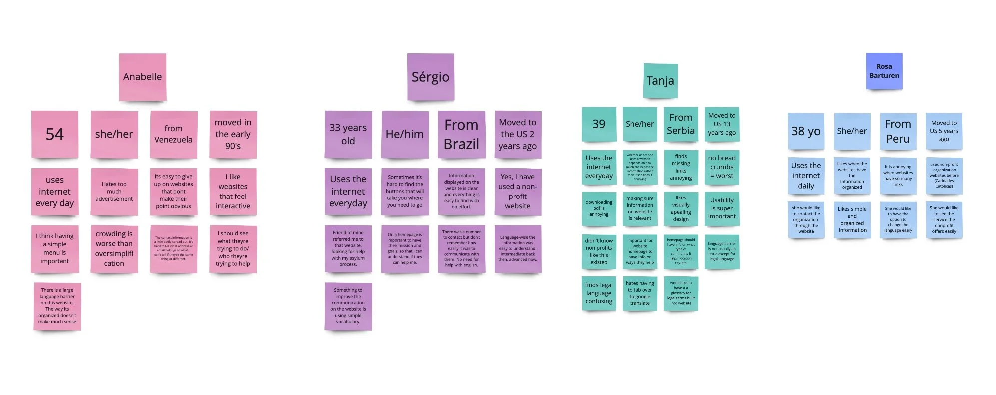
After conducting all of our initial user interviews we compiled all of the data into one document and created five categories: demographics, intent usage, website likes and dislikes, thoughts/experience with non profits, and language barrier. This, along with our 2x2 priority matrix and user persona, allowed us to see patterns which ultimately helped us gain a better understanding of our users and their needs.
User Interviews
“The espanol button under the flag is misleading, I wouldnt know to change the flag to change the language. I genuinly didnt notice the flag until you mentioned it.”
Edward
“It’s hard to follow anything I’m looking at; I feel like I’m on the wrong page even though I know I’m not.”
Annabelle
“It seems like it would be easy to make an appointment because the make appointment button is very apparent but then you get to the form and its so ridiculously long.”
Tanja
User Persona
We took all of the data we collected from our interviews and used it to create a user persona of Marta Perez. Marta, 36 years old, is currently undocumented and living in Daily City, CA but speaks minimal english.
Goals/Needs: Marta is currently working as a babysitter but would like to find permanent work in her field of degree. She is hoping to contact a non-profit online, so that she doesn’t have to miss a day of work, to help with her naturalization process. Marta does need a translator to help her communicate her needs in her a different language (english).
Pain Points: When navigating East Bay Sanctuary’s site, Marta finds it difficult to find the information she is looking for in regards to what the non-profit can do to help her. She tries to sign up for an appointment through their website however the process is very long and she ends up getting discouraged. Marta then calls their office but it goes straight to voicemail.
Design Phase
We began our design process by coming up with design solutions to make the site more accessible for not native english speakers and individuals with low literacy skills. We decided the best way forward was to include lots of visual aids and videos as well as a text to speech button on sections of dense text.
We started with a site evaluation and the creation of a new sitemap. Once we had the flow decided, we began sketching out some of the pages and deciding on the visual design.
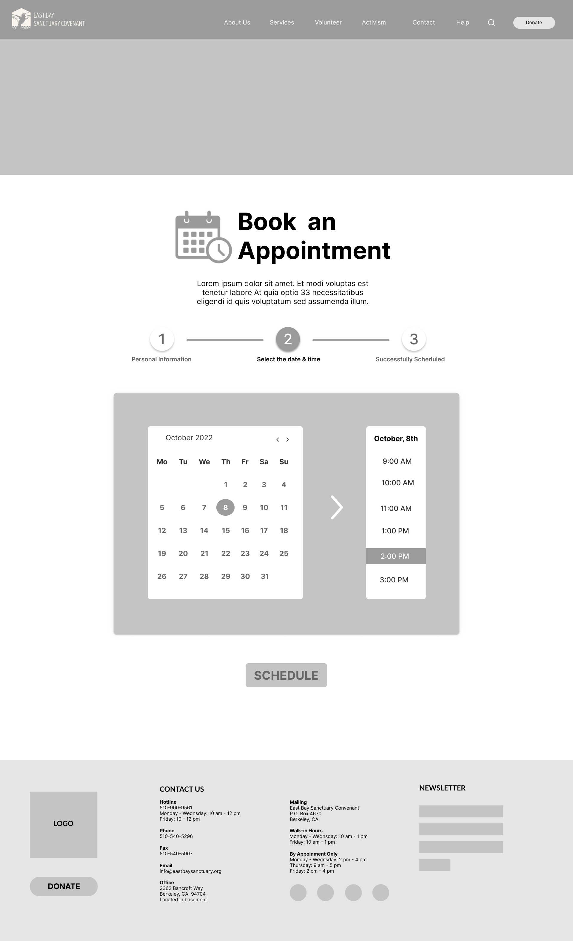
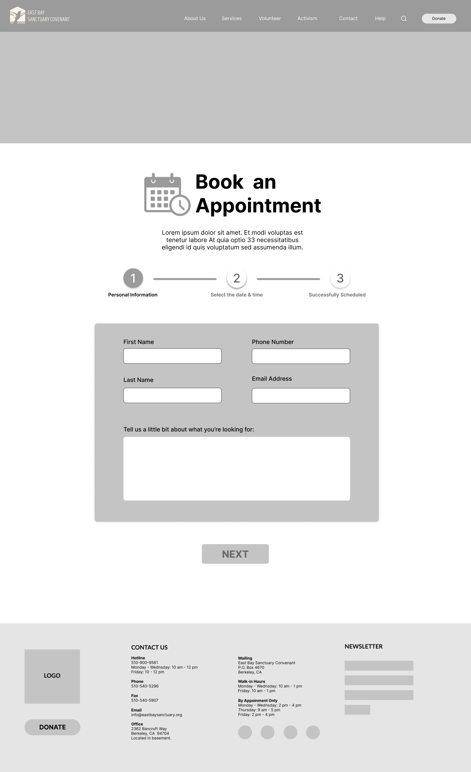
We created low, mid, and high fidelity wireframes making sure to do a round of user testing after each round of iteration.

Original Site Map (left) & New Site Map (right)
Accessibility Solutions
In order to make the site as accessible and streamlined as possible, we decided to include the ability for users to choose their native language before even entering the main site and changing some of the language in the navigation bar at the top to be more universal. During our research process we found that if users are coming to the site it is primarily to find out how to contact the organization or to see how the org. can help them. Because of that we decided to reorganize the content on the home page to have the quick links for contact information and the orgs. location at the top of the page with visual aids for those with low literacy skills.
Re-organizing the information on the home page allows those who have trouble reading to find easy ways to contact East Bay Sanctuary without having to sift through the rest of the site to find the information they need. We also included an accessibility side panel allowing users to adjust the size of the text, change the language and change to dark or light mode.
Desktop Mid Fidelity Wireframes
Visual Design
When we began thinking about the visual design of the new website we wanted to create something that was inviting and bright and, most importantly, rooted in the community. One of the things we learned when talking to East Bay Sanctuary was that they had fairly recently gone through a brand refresh so we decided, since they were most likely going to use our design, we would stick with their branding. They had a solid visual identity but were not utilizing it to the fullest extent so we implemented what they had in a way that was more visually impactful.


