Mochi Eats App Design
Tools Used: Miro, Figma, Unsplash, Adobe Illustrator, Otter, Lucid Icons
Working in a group of five, we decided to create an app that would help prevent cooking related anxiety and burnout. Our unique design allows users to not only search for recipes but plan out their meals by day or week as well as export their weekly grocery lists there by streamlining the planning process.
My responsibilities included research, wire framing, and visual design. Logo and Mochi graphics created by team member Gabriella Collana.
The Problem
Many people have busy work schedules that prevent them from prioritizing their diets. This often leads to overspending on take-out and cooking related anxiety.
Life is complicated but meal planning doesn’t have to be. Everyday life is so hectic and busy that planning your next meal often falls to the wayside. People with busy schedules need a quick and fool-proof system for meal planning in order to make healthier choices, optimize their time, and reduce decision fatigue.
Our solution is to help busy people lead healthier and more sustainable lives by making meal planning more accessible and encouraging people to cook and have more control over their diets.
Our Research
When beginning the research component of our project we began by conducting user interviews to gather preliminary data on users’ likes, dislikes, and pain points. The interviews were conducted both virtually and in person and recorded for research purposes. Our key questions going into these interviews were, 1. What are our users’s concerns when it comes to cooking with the items left in their fridge? 2. What information is important to gather from your users to target specific recipes for them? 3. What encourages people to cook?
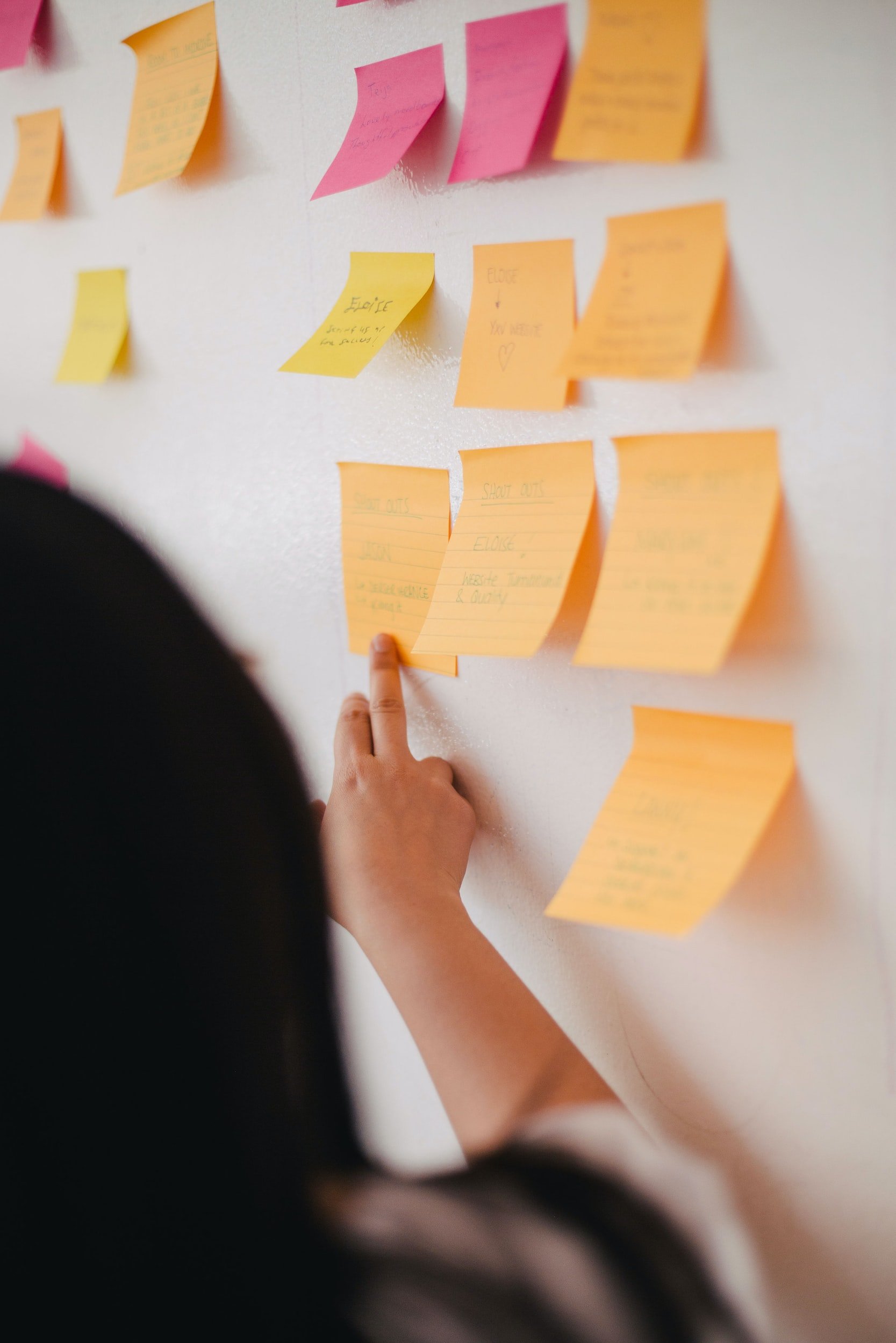
We took all of our data and organized it into an affinity diagram and then a 2x2 matrix.
The majority of the people we interviewed said that they felt stressed about their food choices and had frequent food waste. They also said that it was difficult to cook and plan their meals when they had busy lives. We also conducted an online pole that concluded that 40.9% of people felt stressed when making decisions about meals and food.
User Interviews
“I wish I had access to more recipes for inspiration”
Anna
“It’s not uncommon that I choose not to eat rather than try to figure out what to make”
Tanner
“I get decision fatigue when meal planning all the time. I never know what to cook.”
Jessica
User Persona
We took all of the data we collected from our interviews and used it to create a user persona of Ramona Flowers. Ramona is recently married and lives with her partner in a rented apartment in San Francisco. She works at a start up company and as such has very little time to spend on meal planning, grocery shopping, and cooking in general. Ramona wishes she had an app that could help her handle her decision fatigue and give her access to new recipes.
Goals/Needs: Ramona would like to get better at cooking and gain a sense of confidence in the kitchen. She would like a way to try new recipes that are to her tastes without having to scour the internet. Ramona would also like to have more control over what she eats and save money by reducing her takeout consumption.
Pain Points: Ramona finds it difficult to decide what to eat or buy when she has decision fatigue but is bored with eating the same quick meals everyday. She is also frustrated by having to throw away food that has gone bad which wastes money and is also bad for the environment.
Design Phase
We began our design process by conducting extensive competitor analysis. Our direct competitors were Mealime Meal Plans & Recipes, HelloFresh, and Ends and Stems. After looking and analyzing the things we did and didn’t like in our competitors, the features we wanted to keep and expand upon were a search function, the ability to create a meal plan, and the recipe generation. Our competitive advantage was the open source nature of the app which allowed anyone to post their own recipes resulting in an extensive recipe database.
Once we completed our competitor analysis and decided on our features, we began creating a user flow and then moved on to sketching out the different pages. We then adapted our sketches into wireframes and created low, mid, and high fidelity versions making sure to do a round of user testing after each round of iteration.

User Flow
Low Fidelity Wireframes
Visual Design
We wanted to create a design that was visually engaging but still calm. Our priority was creating a design that made the process of meal planning as easy as possible there by alleviating stress. For that reason we went with a purple and white color scheme to bring a sense of calm and tranquility. We tried to keep the pages as clean as possible to limit visual congestion and clutter allowing for a more seamless and intuitive flow.
We also created a mascot like character called Mochi who appears throughout the app not only to provide encouragement and support but also help with navigation.


